Shop Pick Give – Website
This project was one our team worked on while at Cart.com. We functioned similar to a digital agency for our platform clients, going through the entire UX process from start to finish with them. This project ultimately produced a website that allowed people to purchase items and donate them to their desired charity. There were some road bumps along the way, but we worked out way through them and ended up with a site that had a unique look, and accomplished it’s goal of facilitating charitable donations.

Project Objective
To work with the client to produce a site that would allow people to make charitable donations, doing good for communities, and feeling good about doing it.
My Role
Research
Client Meetings
Information Synthesis
Ideation
Sketching
Wireframing
Site Map/ Information Architecture
Style Guide
Component Design
Artifact Design
Mid-Fidelity Design
High Fidelity design
Research and Planning
This project was a client that came to us while I was working at Cart.com with the idea of a charitable donation site. The sales team spoke with the client and they came on board, and as it came to our UX team, I began research on the space. One of the biggest companies already doing this was Amazon Smile. There were a number of smaller companies also doing the same type of work, but the sites they had looked dated, or they had specific angles to them, like only towing away your old vehicles or only working with youth groups for their donation setups.
We were going for a broader approach, that would allow us to market and cast as wide a net as we could possibly do while still remaining targeted. To accomplish this, we set up our site planning to allow donation groups and types of all kinds and avenues, so that as many people could participate as possible and make donations to as many groups as possible. We also wanted to make the sign up process as simple and easy as possible, to keep the barrier to entry low for any participating parties. We collected as many ideas and flows as we could in a short time, to make sure we were giving ourselves a good idea of our competitors process and the types of things that they included in their flows. We built our own user journeys and flows after this competitive research.
Research and planning
We looked at what other companies were doing well, how they did it, and how they related their designs back to their assumed business goals. We set up planning ideas and asked ourselves questions about how we should accomplish this. Adding notes and documenting ideas that might for for this client are all part of that process.
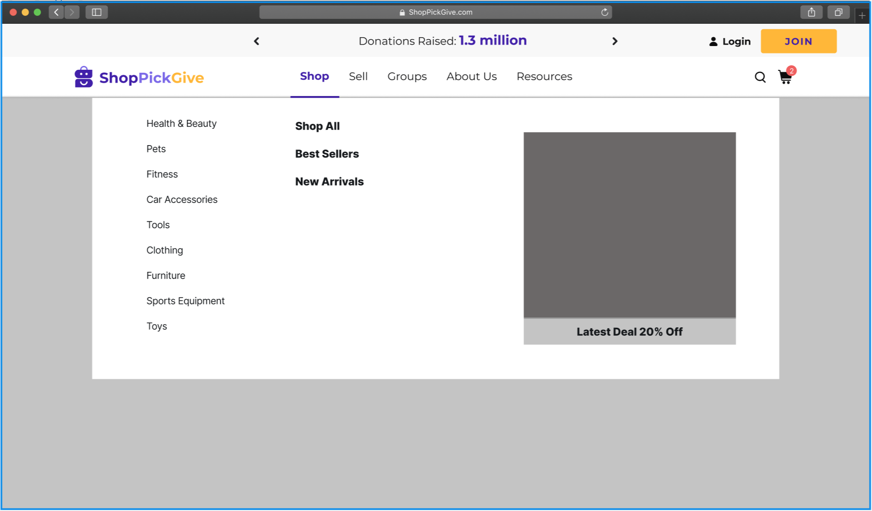
Mid fidelity ideas for the menu setup.
Starting to think through the main navigation menu and categories that we might want to include.
Style Guide and Design Guidelines
Setting up and creating a style guide is a must-have. Even if it’s a lightweight version that needs to be updated as you go through the process, having one to guide designs is key. Defining colors and font styles for both desktop and mobile really helped improve the speed of the design output as I went through this process.
Mid Fidelity to High Fidelity
Sketching and mid fidelity designs are always a good place to start to work out flows and ideas. Here is an example of the mid-fi homepage design. We kept the general layout, but really had to apply our style guide and more polished ideas to give it the final touches for the high fidelity finished product.
Grids, components and styles for this project.
Outcomes
This project turned out really well, and ultimately was a positive experience for the myself, the client and for our team.
It was a great opportunity to really connect the research into other platforms and services, and really be able to put a cohesive design together that met those business needs.
After completing the handoff with our development team, the budget and scope didn’t allow for much more work on from our team, so this was the last part of this project that we saw through to completion.
Next Steps
If we did have more time and budget, ideally I would look through the analytics and see how the site is performing, what types of products are selling, and what organizations are being found and donated to. With any budget to do user testing, I would love to see what types of problems users are encountering on the site, where the in the flows they are getting lost or frustrated, and begin to smooth out those issues.

